
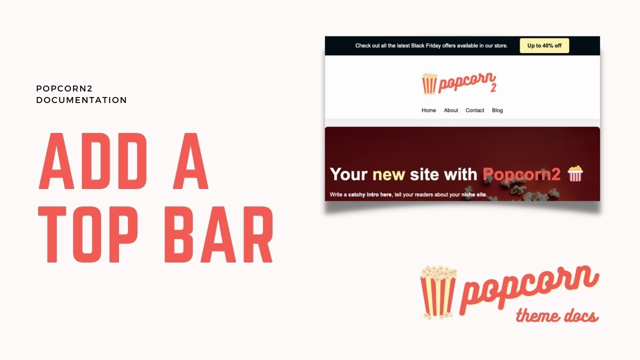
Many sites include a top bar above the header on their sites to keep some important links visible throughout the site. This can be icons for social media, buttons for key offers & affiliate links and so on.
In this guide, we’ll show you how to add your own header with a top bar.
Table of Contents
Launch the Site Editor
You can load the Site Editor from the Front End of your Site or from your WordPress Dashboard, we will cover both here.
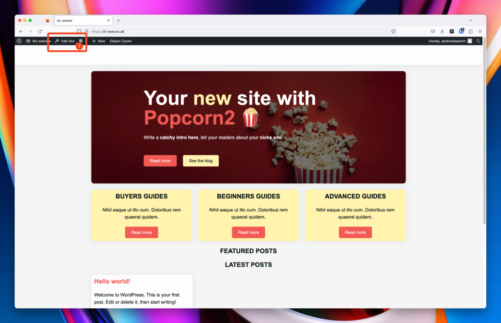
Launch Site Editor from the Front End
From the front end of your site you should see the WordPress Admin Bar. Click Edit Site (1).
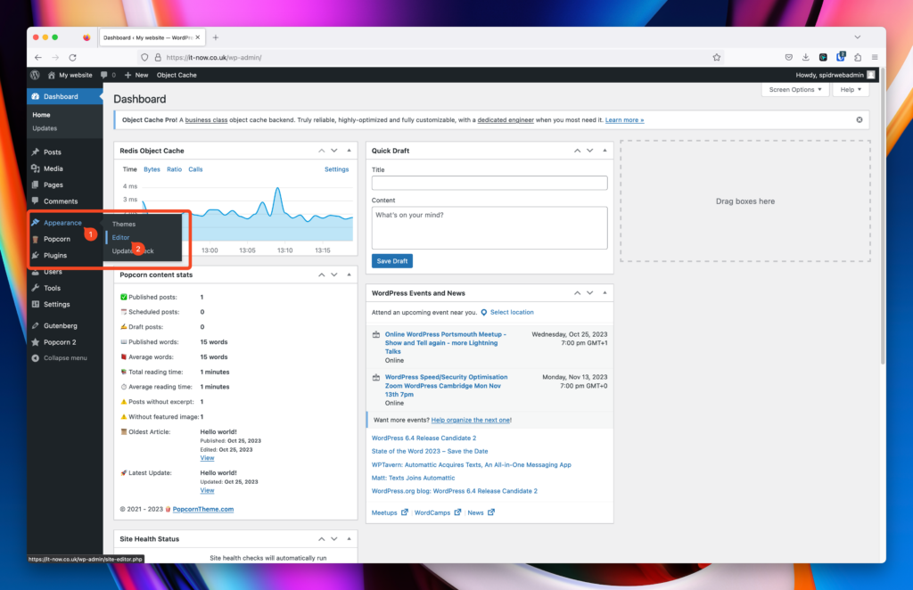
Launch Site Editor from the WordPress Dashboard
From the WordPress dashboard of your site click Appearance (1) > Editor (2).
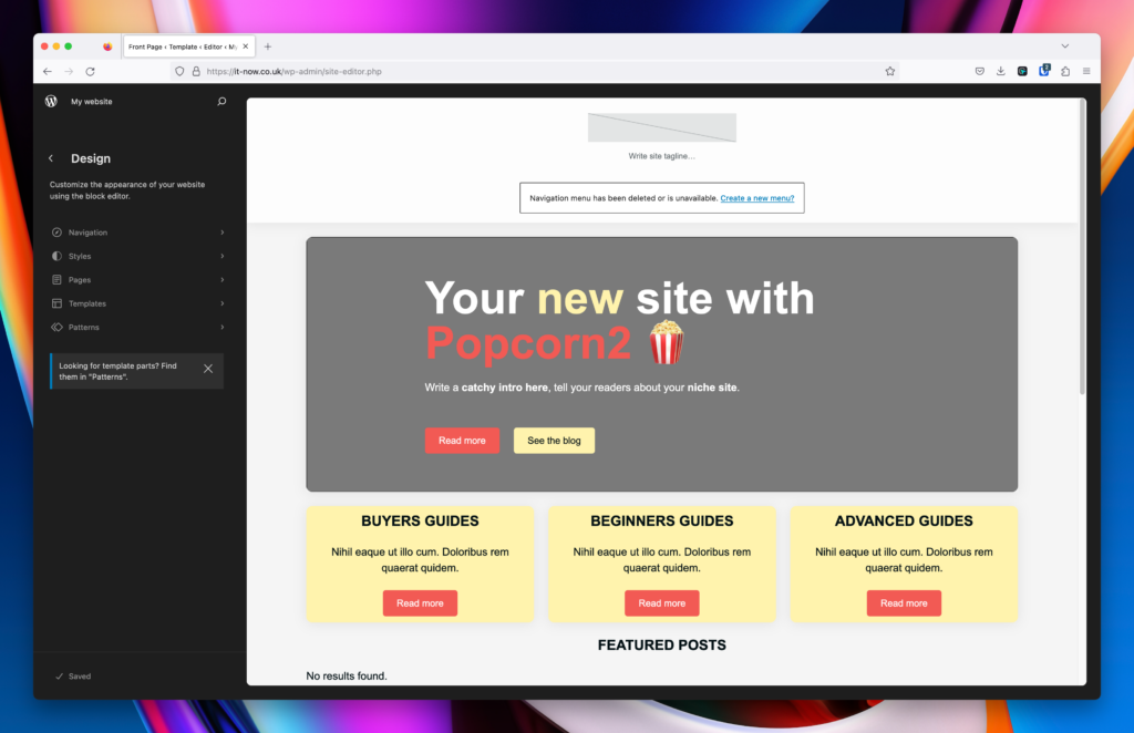
The Site Editor should now be open and look like this:
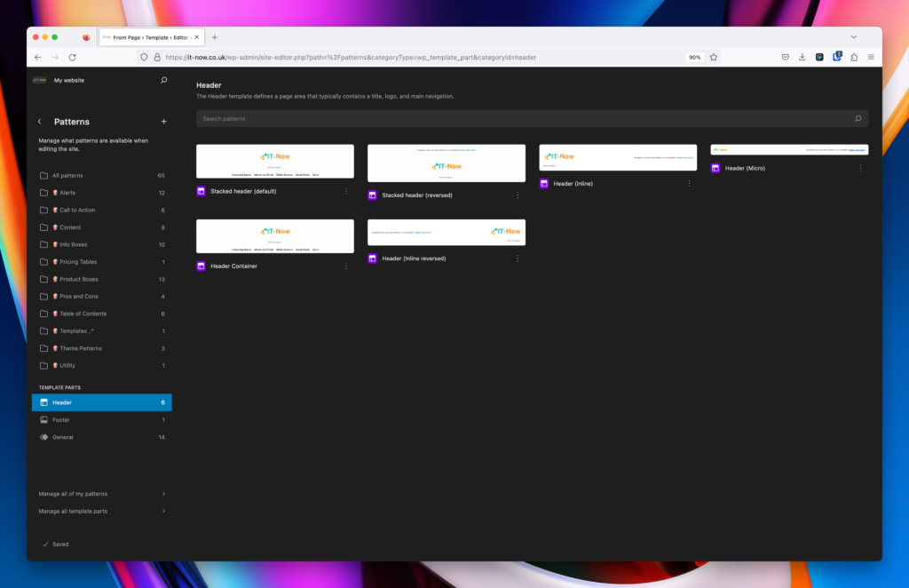
Add a Top Bar to your Header
Once you have opened Site Editor, follow the steps below to add a top bar.
Open the appropriate Header for your site.
In this example we will use the default Stacked Header
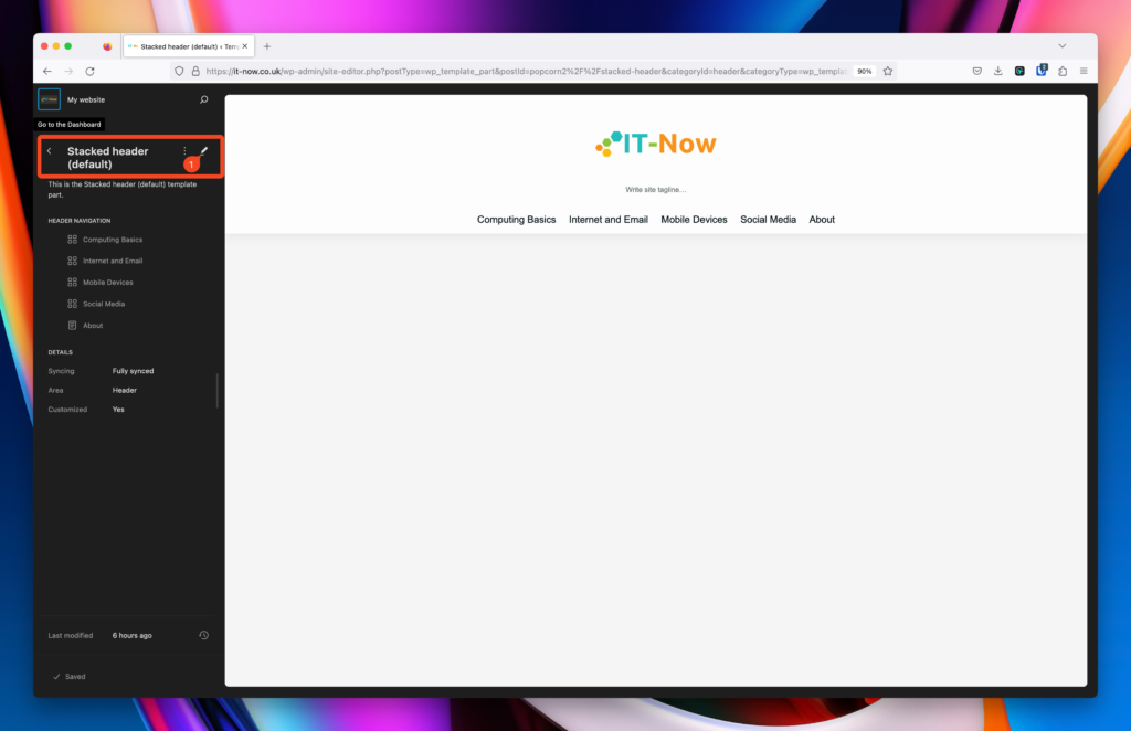
Click the pen 🖊️ icon (1) to edit that template.
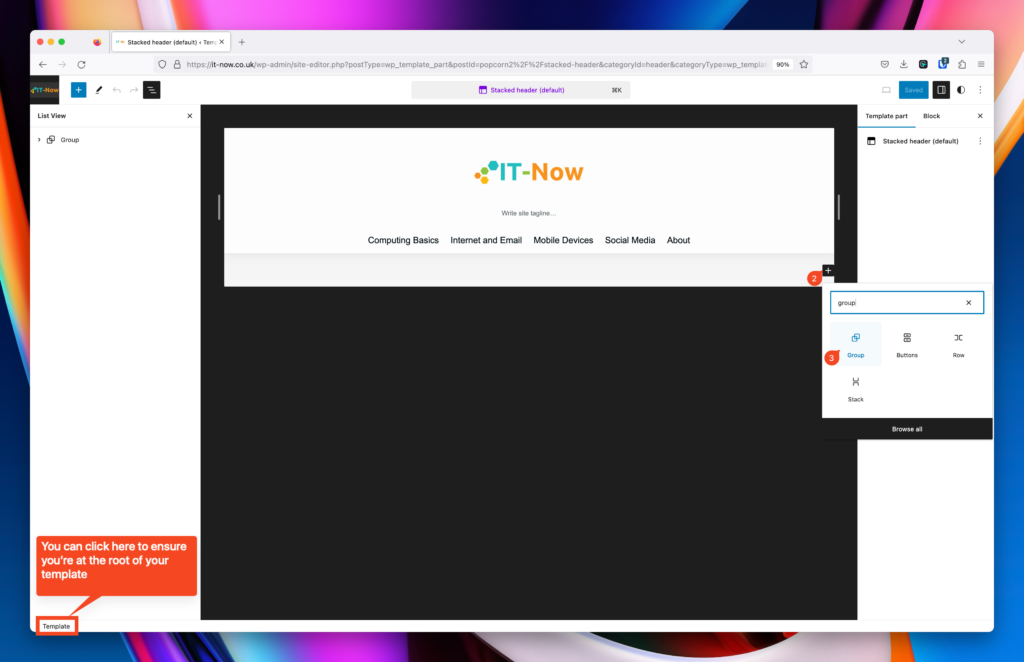
At the root of the template, we want to add a group block.
Click plus + (2) and select group (3)
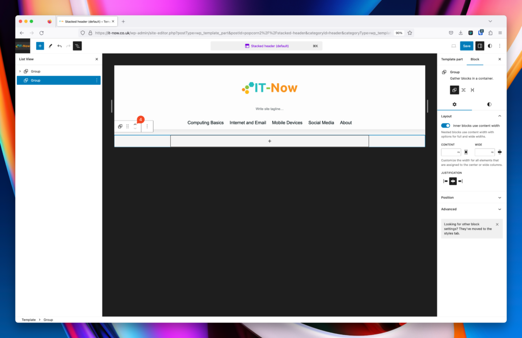
Once you have added the group, you can now move it above the original group by clicking the up chevron (4) on the block toolbar.
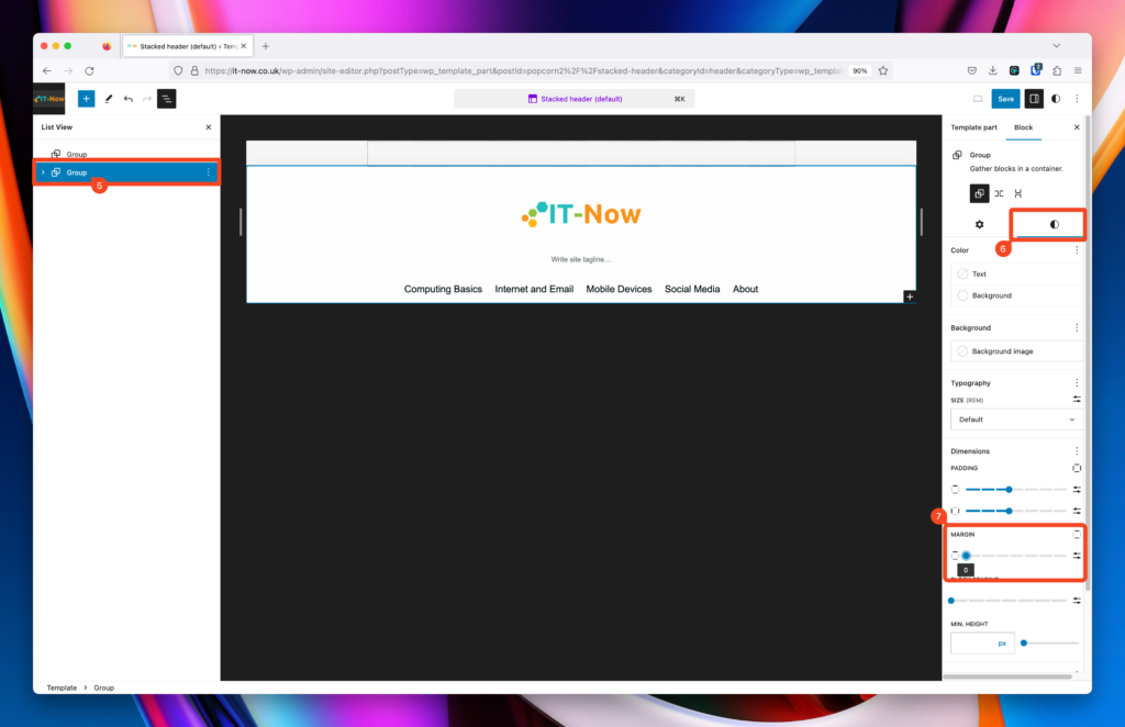
If theres a gap between your top bar and the original group, you will need to remove the Margin of the original group
Select the group (5), select styles (6) and then reduce the margin (7).
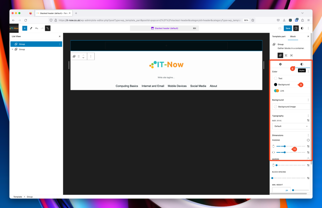
In the Styles Pane (8) we can set a background color text and link colors (9) for this group. Any child blocks should inherit these colors.
While We’re there we’ll set some padding too (10).
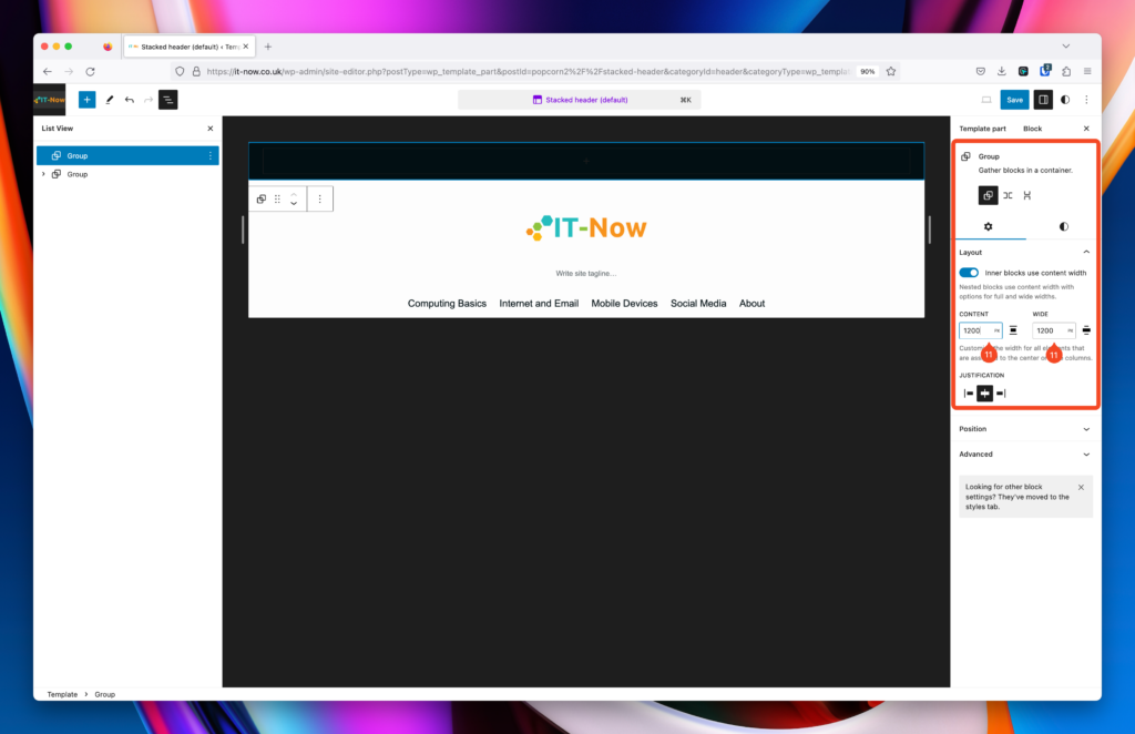
By default, the group will usually use 800px width for its content, since this is a header element we want to widen that, so we’ll use 1200px (11) to match the rest of the header.
You can add anything you want iin this top bar, in this example I will add a navigation for site pages as well as some social links.
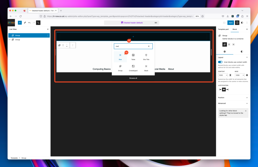
Add a row within your group that you created.
Click Add Block (12) and search for Row (13).
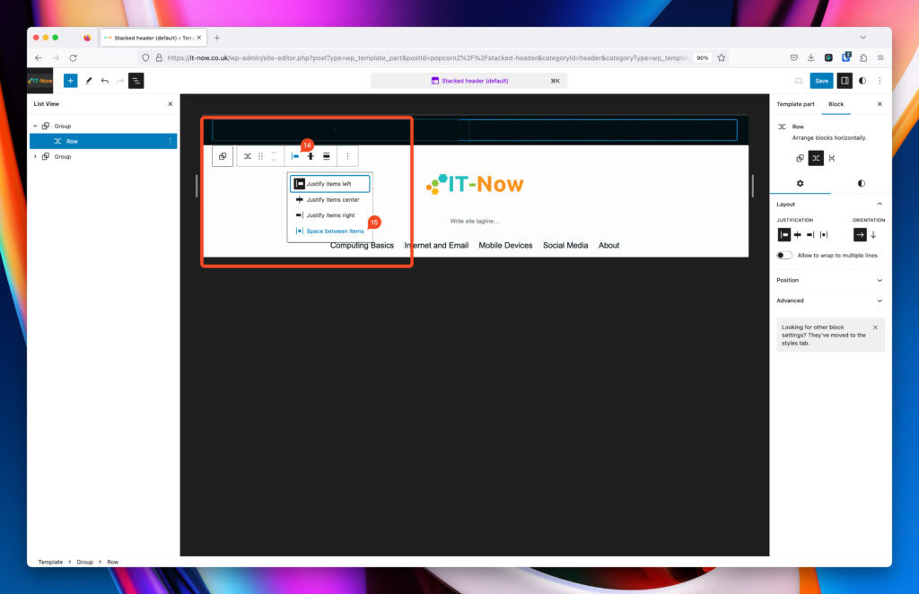
I want the child items of this row to be spaced apart which meand that there will be equal spacing between child blocks. On the left will be a navigation and on the right will be social icons. Click Change justification items (14) then click space between (15).
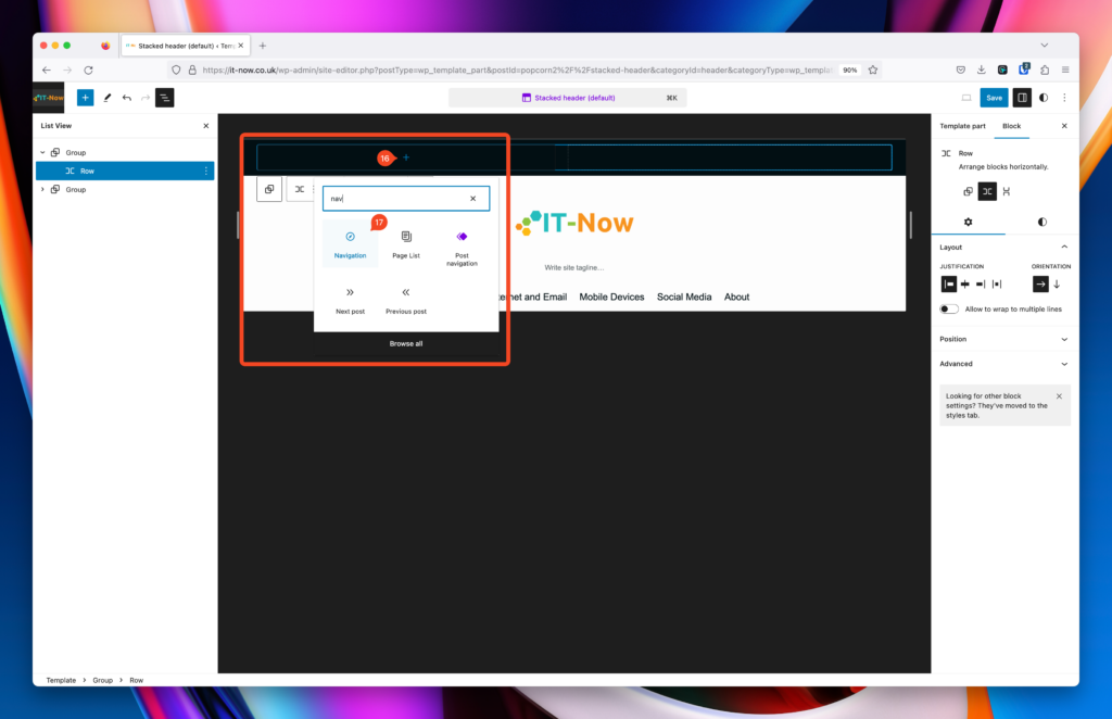
Now lets add the navigation, click Add Block (16) then search for Navigation (17).
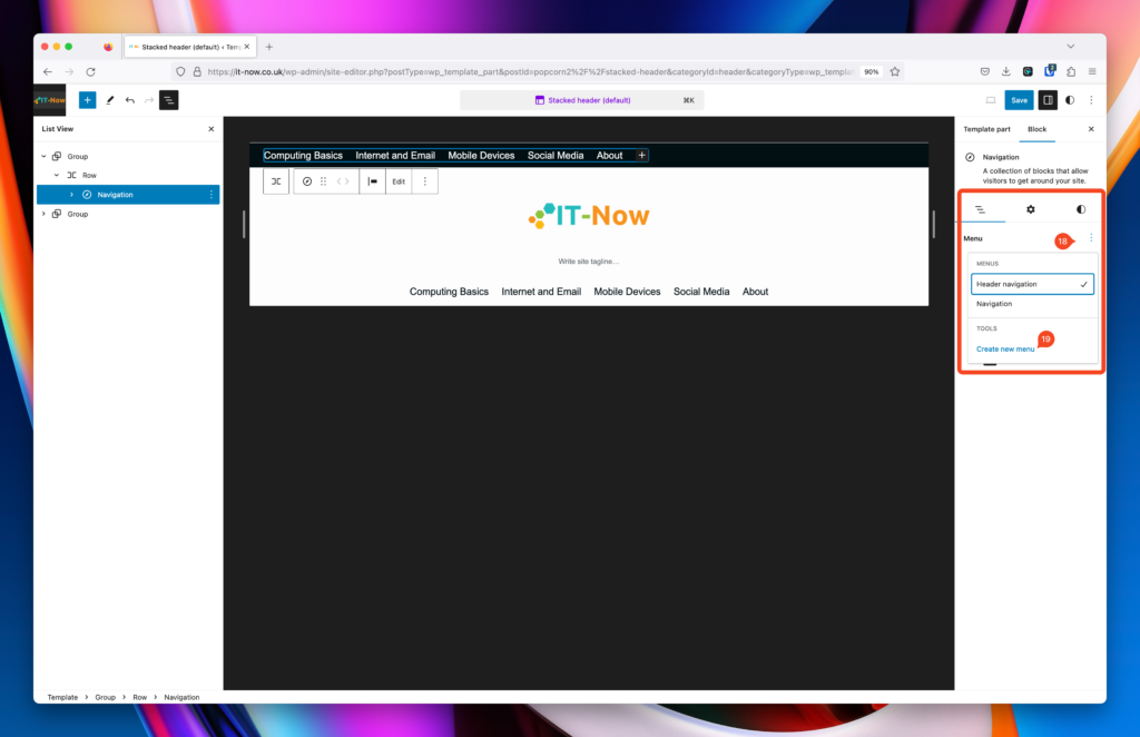
By default your first nav menu will appear, lets create a new one for this though.
In the navigation block pane, click the 3 dots (18) and click Create new menu (19).
Follow this guide here on how to use the navigation block.
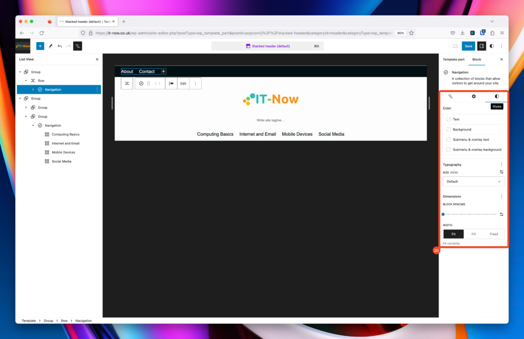
It should look something like the image, feel free to adjust colors and typography as needed (20).
In list view, click on the row (21), click Add Block (22) and select Social Icons (23).
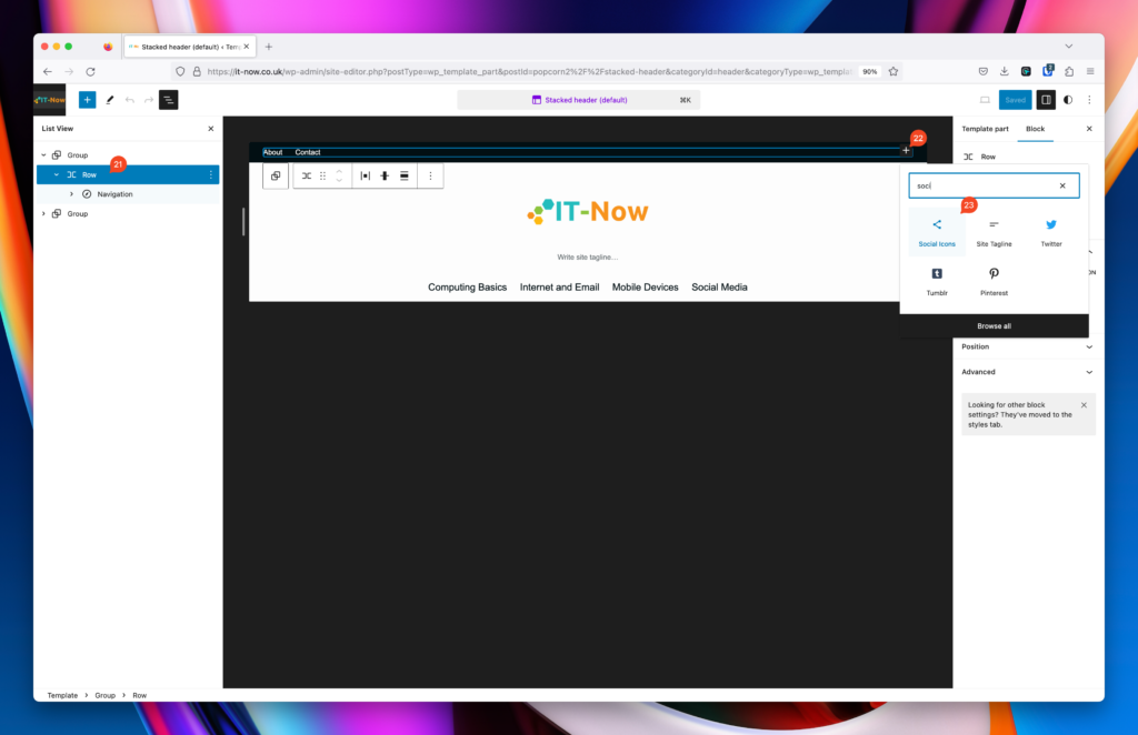
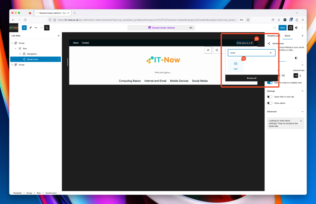
Now you can add your social links / other links. Click on Add (24), then search and add your social icons (25).
Note: you can add links by clicking on the icons.
Thats the basics of adding a top bar in Popcorn Theme, remember to experiment and see what works best for your site.
The code for the blocks that we added are below, feel free to use them in your site.
<!-- wp:group {"style":{"spacing":{"margin":{"top":"0","bottom":"0"},"padding":{"top":"var:preset|spacing|30","bottom":"var:preset|spacing|30","left":"var:preset|spacing|30","right":"var:preset|spacing|30"}},"elements":{"link":{"color":{"text":"var:preset|color|popcorn-primary-color"},":hover":{"color":{"text":"var:preset|color|popcorn-secondary-color"}}}}},"backgroundColor":"popcorn-tertiary-color","textColor":"popcorn-quinary-color","layout":{"type":"constrained","contentSize":"1200px"}} -->
<div class="wp-block-group has-popcorn-quinary-color-color has-popcorn-tertiary-color-background-color has-text-color has-background has-link-color" style="margin-top:0;margin-bottom:0;padding-top:var(--wp--preset--spacing--30);padding-right:var(--wp--preset--spacing--30);padding-bottom:var(--wp--preset--spacing--30);padding-left:var(--wp--preset--spacing--30)"><!-- wp:group {"layout":{"type":"flex","flexWrap":"nowrap","justifyContent":"space-between"}} -->
<div class="wp-block-group"><!-- wp:navigation {"ref":24,"fontSize":"popcorn-font-s"} /-->
<!-- wp:social-links -->
<ul class="wp-block-social-links"><!-- wp:social-link {"url":"mailto:[email protected]","service":"mail"} /--></ul>
<!-- /wp:social-links --></div>
<!-- /wp:group --></div>
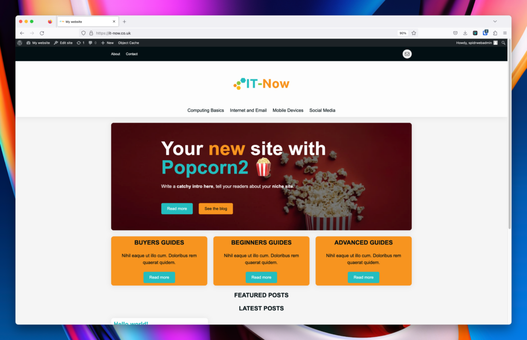
<!-- /wp:group -->Heres how it looks like in action:
Reverting or restoring template parts back
In block themes you can easily revert or clear any configurations back to defaults.
Open any template or template part that has been changed, and clear customizations (1).
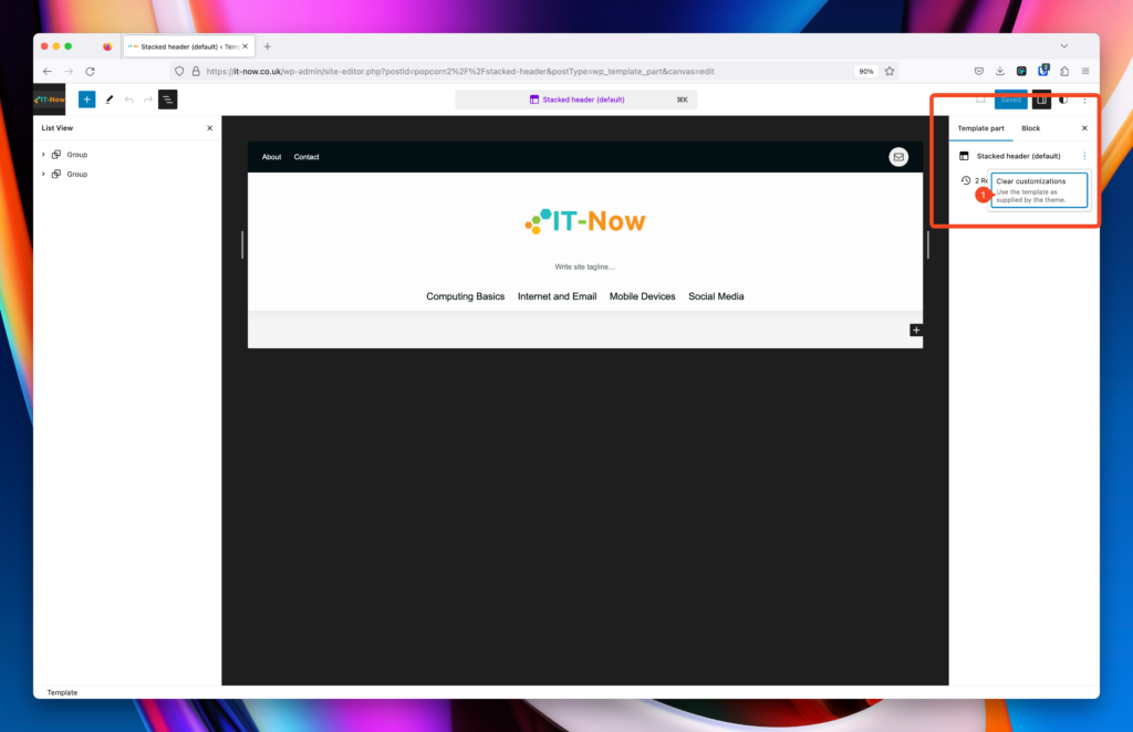
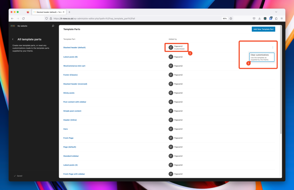
Alternatively you can clear customizations without opening the template in Manage All Templates.
You can also easily see where you have made changes (2).
Click Clear Customizations (3).
Restore from a different revision
You can also restore to a different revision (4) if you want to go back a couple of steps.

Leave a Reply