Popcorn Theme is a block theme and it is very powerful and means you can pretty much create anything.
In this article I will go over some of the block basics for Popcorn Theme.
Table of Contents
What are blocks?
“Blocks” are individual units or components that you can add to your posts or pages to create and format content. Instead of a single monolithic editor, we now have a block-based system, where each piece of content, whether it’s a paragraph, image, video, quote, or more, is represented by a distinct block.
Blocks can be used anywhere within Popcorn Theme including the templates of your site.
What is a Template?
A template is essentially the rules of what your dynamic (post / pages / categories etc) will follow. you can create and edit Popcorn Templates that will globally change the way your site looks and feels. This is all achieved in the Site Editor.
How to access the site Editor
Launch the Site Editor
You can load the Site Editor from the Front End of your Site or from your WordPress Dashboard, we will cover both here.
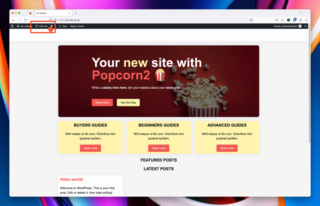
Launch Site Editor from the Front End
From the front end of your site you should see the WordPress Admin Bar. Click Edit Site (1).
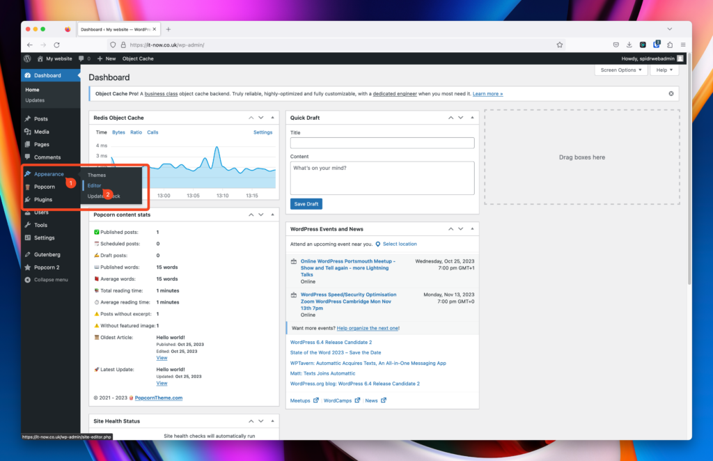
Launch Site Editor from the WordPress Dashboard
From the WordPress dashboard of your site click Appearance (1) > Editor (2).
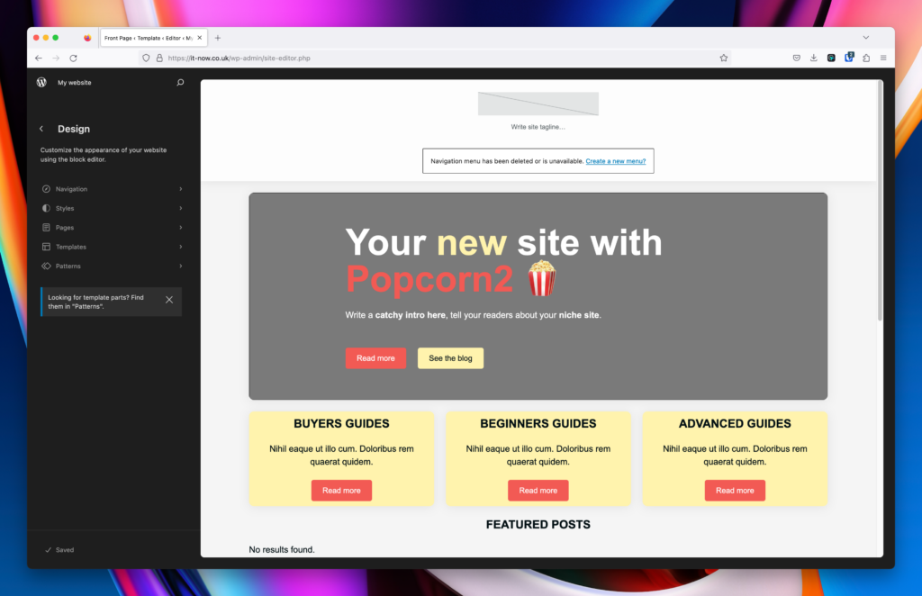
The Site Editor should now be open and look like this:
Types of Blocks
Popcorn Theme hooks into the standard blocks which are available in WordPress so you have access to all of the following across all your blog posts, pages, custom post types and site editor.
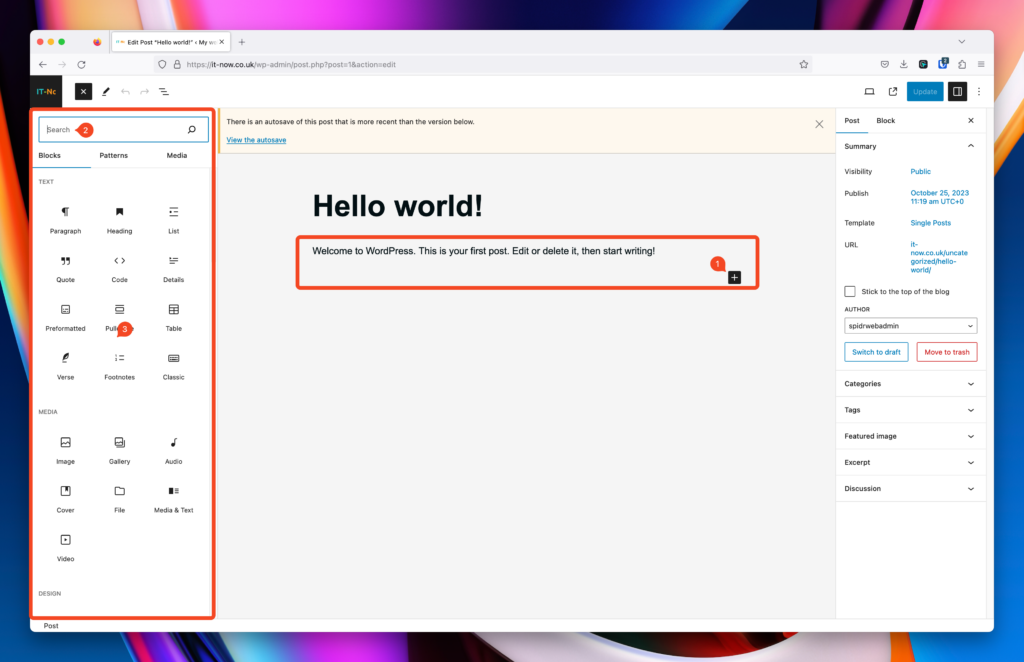
You can click the plus + (1) and select a block to add, search (2) for a block or select from the list (3).
List of Available Blocks
Text Based Blocks
Paragraph Block
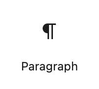
The most commonly used block, write content and style appropriately. Popcorn Theme adds variations available for the Paragraph Block.
Heading Block
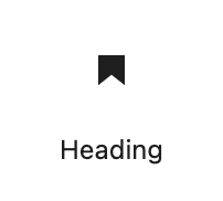
Creat Headings in your content and structure your articles with H1 > H6 heading levels
List Block
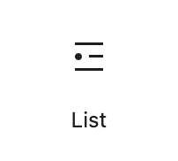
You can add unordered lists and ordered lists in your content. Popcorn Theme adds extra styles with some icons as well
Quote Block
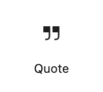
The primary purpose of the Quote Block is to highlight and differentiate quotations, testimonials, or cited content from the main body of text, making it visually distinct and easily recognizable to readers.
Code Block
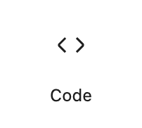
The Code Block is intended for showcasing code snippets, scripts, or technical commands within posts or pages. It helps differentiate code from regular content and provides a more readable format for code.
Details Block
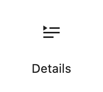
The Details Block allows you to add accordian style content to your site. (Just like this section 😉)
Preformatted Block
The primary function of the Preformatted Block is to present text exactly as it’s typed, without any additional formatting or adjustments. This is particularly useful for content where the original spacing and line breaks are important.
Pullquote Block
The Pullquote Block serves to emphasize a specific quote or passage from a post or page. By making this quote visually stand out, it can draw readers’ attention and underscore a central theme or message of the content.
Table Block
The “Table Block” in Popcorn Theme allows you to insert and format tables within your content, offering options for rows, columns, and basic styling to organize and display tabular data.
Verse Block
Great for Poetry and Song Lyrics
Footnotes Block
The “Footnotes Block” enables you to add referenced footnotes to your content, ensuring a structured and accessible way to provide additional information or citations.
Classic Block
The “Classic Block” in Popcorn provides a familiar editing experience for you, replicating the previous classic editor’s interface and functionality within the new block-based system.
Media Blocks
Image Block
Add imaged to your content and format accordingly. Options for adding alt text and links are available here.
Gallery Block
Add a gallery into your content or pages showcasing your images.
Audio Block
Here you can embed a simple audio player into your site. Upload audio files, or one from your media library or URL.
Cover Block
Add an image to your content with the ability to overlay text or any other blocks. The Popcorn Hero is based on this block.
File Block
Create a link to a downloadable guide or file – Upload or pick from the media library.
Details Block
The Details Block allows you to add accordian style content to your site. (Just like this section 😉)
Media & Text Block
This block is a great way to show media and text side-by-side, an alternative to using inline images or columns.
Video Block
Using the Video Block, you can upload a video, embed one from the Media library, or choose via a URL.
Design Blocks
Buttons Block
Add buttons to your site or content using this block. Popcorn adds different styles as well.
Columns Block
With this block you can display content in multiple columns or mix and match images / media with text and headings.
Group Block
Use the group block to group certain items together, great for creating reusable patterns as well throughout your site.
Row Block
Like the group Block, you can use the Row Block to group items but in a row format.
Stack Block
Similar to the Row block, but stack your content instead.
More Block

Content before the More Box will be used to form a default Excerpt for your articles.
Page Break Block
Using this block, you can seperate your articles into a Multi page experience.
Separator Block
You can add horizontal separators to your content using this block. Choice of styles and colors available.
Spacer Block
Add some space between content on your site where Padding and Margin wouldn’t apply.
Table of Contents Block
Add a table of Contents to your content automatically. This is per post / page, not globally.
This covers the basic block items available for your content. Some Plugins will also add many more blocks as well giving you greater flexibility for content and design. Other blocks include but are not limited to are:
Block Toolbars
Every Block has an inline toolbar associated with it. Heres some examples of what they may look like.
Toolbars
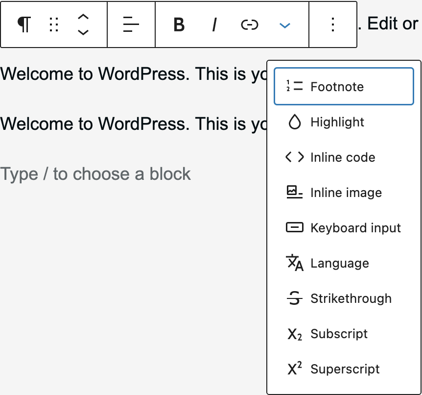
Paragraph Toolbar Example
Using this toolbar you can do the following:
List Item Toolbar Example
Using this toolbar you can do the following:
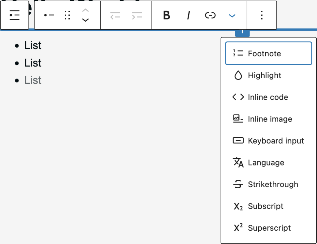
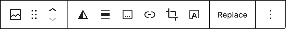
Image Toolbar Example
Using this toolbar you can do the following:
Options for all blocks
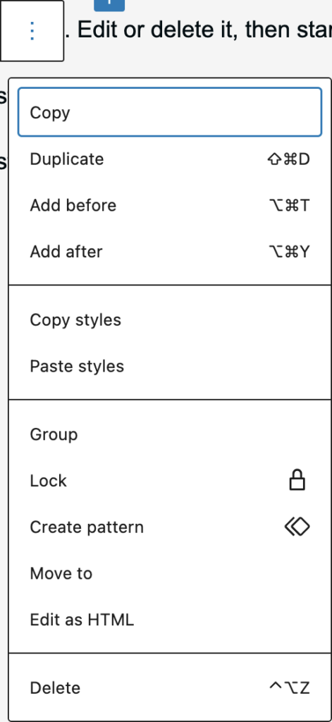
You’ll notice that each block has an options button (3 dots) You can…
The toolbar is a powerful tool when it comes to editing your content or your site templates with Site Editor.
List View Block Options
When you open List View there are some more options for each block. List view allows you to see the structure of your content or template using Site Editor.
We recommend enabling list view to be open by default – to find out how, click here.
Options for blocks within list view
- Select List View
- See the Outline of your article
You’ll notice that each block has an options button (3 dots) (16) You can…
- Copy a block
- Duplicate a block
- Add a block before this block
- Add a block after this block
- Copy the styles applied to this block
- Paste styles from another block to this block
- Group this block within a Group Block
- Ungroup a block if it is grouped
- Lock this block to disable movement or prevent removal
- Create a pattern from this block
- Rename a block (Requires Gutenberg)
- Move the block
- and Delete the block.
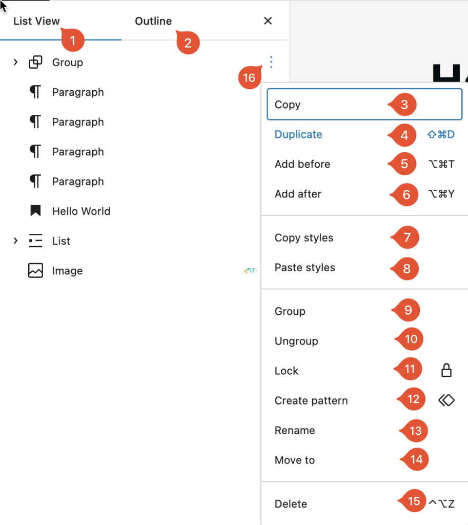
Note that some blocks may show different options depending on the block or state of the block.
The Block Panel
On the right hand panel, you’ll see even more options relating to the selected block. This can be relating to Color, Styling, Typography, Dimensions and more. Heres some examples to get you on your way…
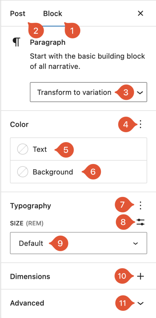
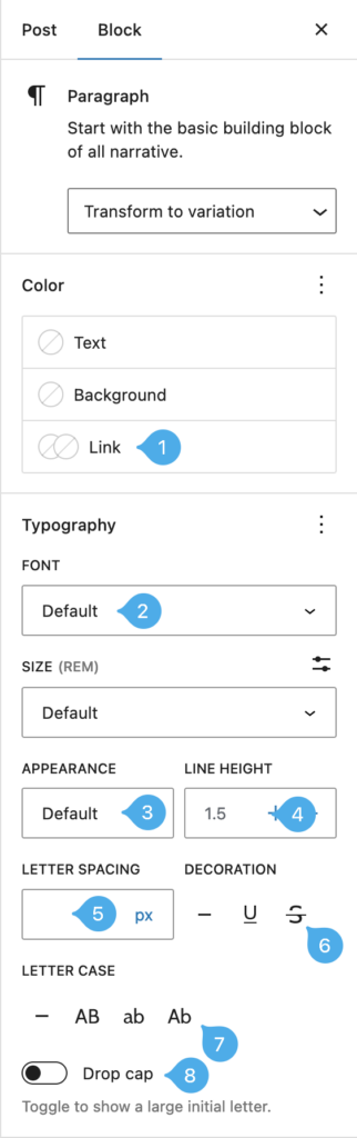
Paragraph side panel default
- Select Block to change settings for the block you are editing
- Go back to Post Settings that affect the entire post / page / template you are on.
- Transform your block to a different variation (if available)
- Enable visibility of extra options for color (if available). You can also reset here.
- Change color of text
- Change background color
- Enable visibility of extra options for Typography (if available). You can also reset here.
- Set sizes manually
- Choose from a redefined list of typography sizes
- Enable visibility of extra Dimensions
- Expand the advanced section
Lets enable everything… 💥
Paragraph side panel with everything visible
Note the extra settings….
- Link Color / Hover Color
- Font Face
- Font Appearance / Weight
- Line Height
- Letter Spacing
- Text Decoration
- Letter Case
- Drop Caps
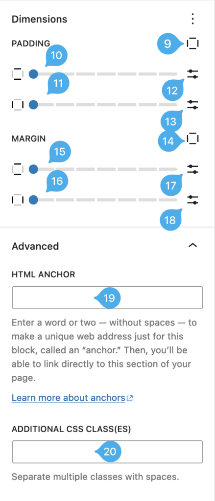
- Select Top, Right, Bottom, Left, All or Custom padding
- Adjust Top and Bottom Padding
- Adjust Left and Right Padding
- Apply custom Padding top and Bottom
- Apply Custom Padding Left and Right
- Select Top, Right, Bottom, Left, All or Custom margin
- Adjust Top and Bottom Margin
- Adjust Left and Right Margin
- Apply custom Margin top and Bottom
- Apply Custom Margin Left and Right
- Add HTML Anchor
- Add custom CSS Classes
Now lets look at the image sidebar Block.
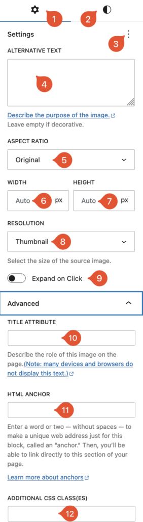
Image side panel with everything visible
Heres all the options for images…
- Block settings
- Block Styles
- View or reset settings
- Image Alt text
- Set Image Aspect Ratio
- Set image width
- Set Image Height
- Set resolution
- Enable Expand to Click
- Add Title Attribute
- Add HTML Anchor
- Add custom CSS Classes
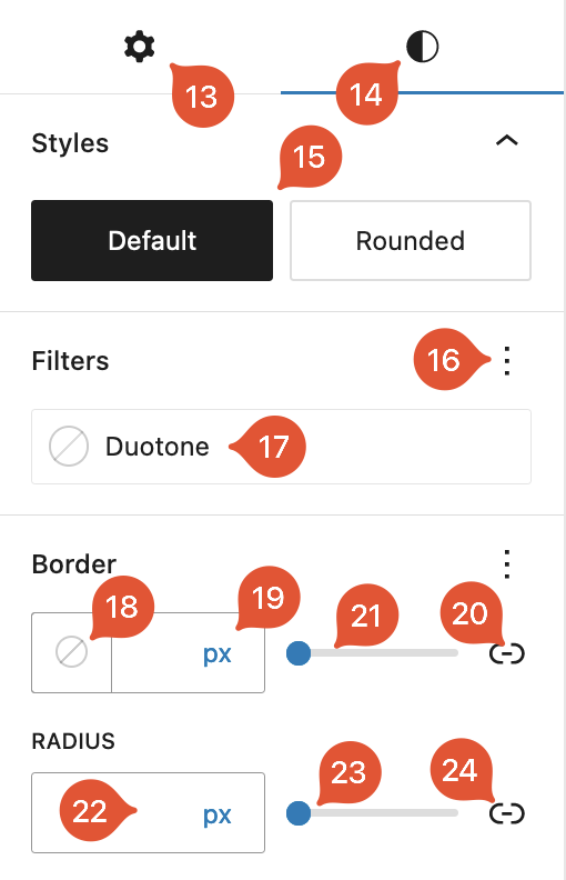
Now click on Block styles (2)
- Block Settings
- Block Styles
- Select from a predefined style
- Reset / Show or hide other filters if available
- Select a predefined / custom filter
- Select Image border color
- select border color width
- slider for border color width
- Unlink / link boders
- Set a border radius
- Slider for border radius
- Unlink / Link Border Radius
As you can see, the options are almost endless allowing you to really make a unique affiliate site using Popcorn Theme. We have only scratched the surface here.
Leave a Reply