
The paragraph block will be the most used block in your affiliate site, while its a fundamental basic block, its still very powerful. In this guilde we’ll go over some of the basics.
Table of Contents
RESOURCES
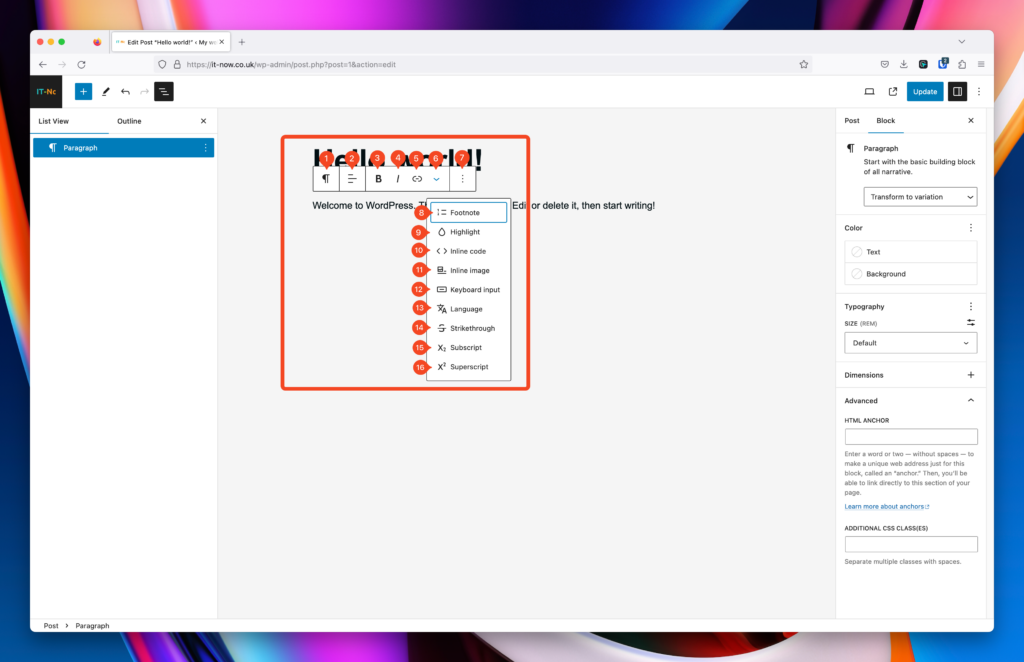
Tool Bar
With the tool bar, you can quickly access the most common settings used in Paragraph Blocks.
Heres a short run-down of what the icons mean in the tool bar.
- Paragraph Block – Change to a Popcorn Pattern, Heading, List or Quote (and more)
- Justify text
- Bold selected text
- Make selected text italic
- Add a link to selected text
- Sub Menu
- Block Actions (Copy, Delete, Duplicate etc)
- Add a footnote
- Highlight text
- Inline Code
- Inline Image
- Keyboard Input
- Language
- Strikethorugh selected text
- Subscript selected text
- Superscript selected text
Variations
Popcorn Theme has a number of variations of the Paragraph Block. When you select a the paragraph block, you can see that we have added a number of variations.
Select your paragraph block, and change the variation.
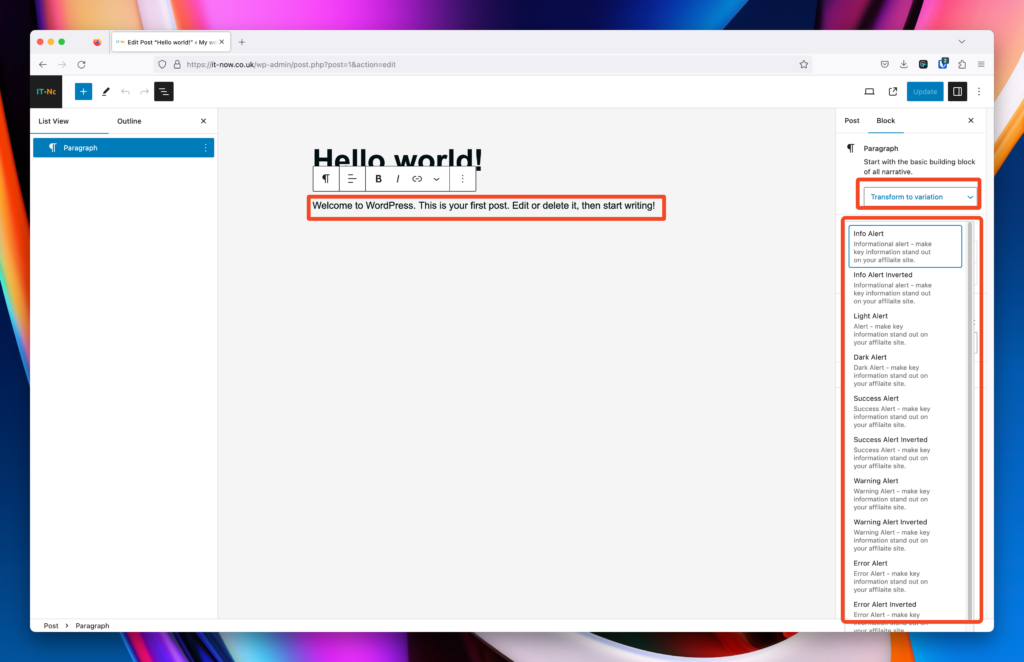
Variation : Info Alert
Variation : Info Alert Inverted
Variation : Light Alert
Variation : Dark Alert
Variation : Success Alert
Variation : Success Alert Inverted
Variation : Warning Alert
Variation : Warning Alert Inverted
Variation : Error Alert
Variation : Error Alert Inverted
Note: Variations are not the same as Popcorn’s Alert Patterns.
Color
For each block of paragraph text, you have the freedom of choosing the text color, background color, and link color.
You’ll notice that there is a color pane on the right.

Select a paragraph block and choose a color.
As with the text color, you can also change your background color for that Paragraph block. By adding a background, you’ll get some default padding added. Go to the Dimensions section to change this.
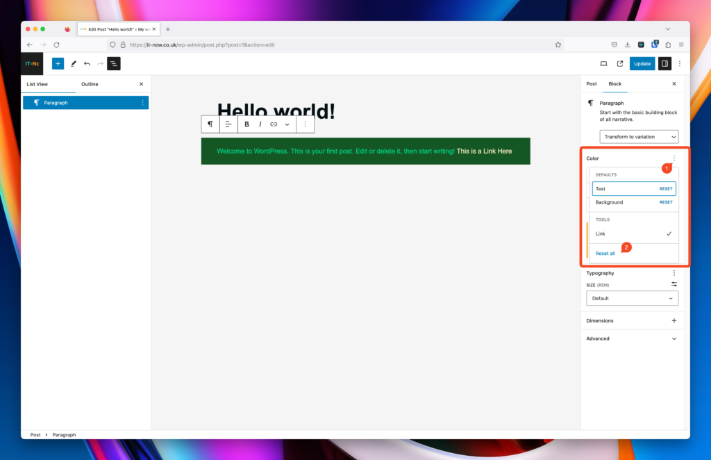
By default, your link colors is your global primary color, however you can change this on a block level. First, enable Link Colors in Color Options. Select Color Options (1) then Click Link (2).
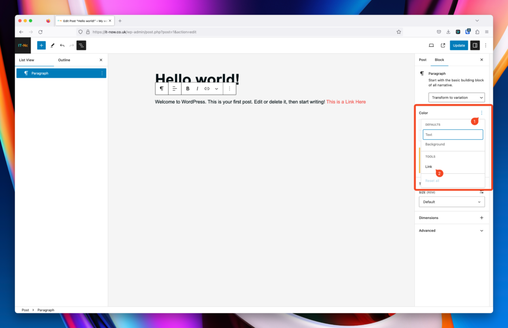
Note that you can not only change the link color but also the hover color as well.
And if you need to reset back to defaults, simply click Color Options (1) and Reset All (2).
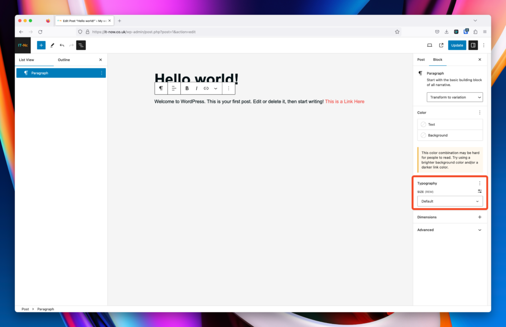
Typography
WordPress / Gutenberg has great flexibility when it comes to typography.
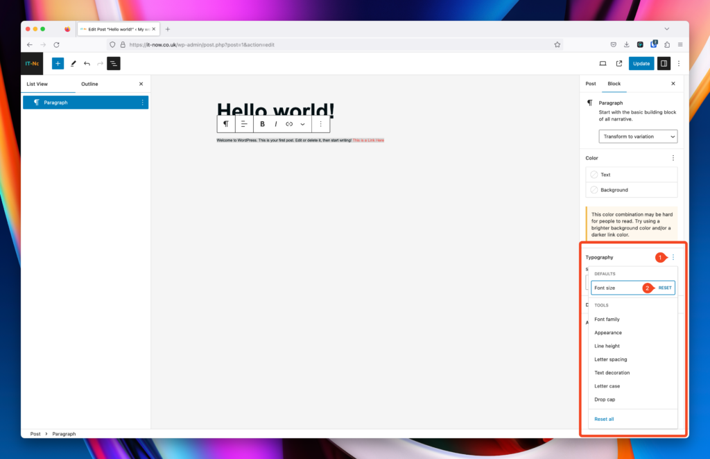
Enable the Typography item you want to edit with Typography Options (1).
Note: Font Size is always available in the panel.

More details on these are below:
Font family (2)
Select the font that you would like to use for your paragraph block.

Popcorn Theme uses Web Safe Fonts which means that theres no external fonts loaded by default. you can select from the following fonts for your paragraph block.
Default (Arial)
Arial Black
Arial Narrow
Baskerville
Brush Script
Copperplate
Courier New
Garamond
Georgia
Helvetica
Lucida Bright
Palatino
Papyrus
Tahoma
Times New Roman
Trebuchet MS
Verdana
You can also use your own custom fonts with Popcorn as well. Read more here on how to do that.
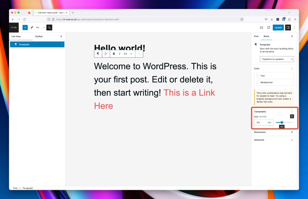
Size
Popcorn comes with Fluid Typography by default.
Fluid typography in web design refers to the practice of using scalable type sizes instead of fixed ones. The idea is to allow the font size to adjust smoothly based on varying conditions, most commonly the viewport width of a device. This approach ensures that typography remains proportional, readable, and aesthetically pleasing across a wide range of devices and screen sizes, from small mobile phones to large desktop monitors.
Select the font size of your paragraph block either from pre-defined sizes or set them to a fixed size.
Fluid font sizes in Popcorn are set to the following:
XXX Large
XX Large
X Large
Large
Medium
Base
Small
X Small
You can also select fixed font sizes using px, em and rem.
And if you need to reset back to defaults, simply click Typography Options (1) and Reset (2).
Appearance (3)
Setting the appearance of your paragraph block is also achievable using either Site Editor or in your pages, posts and custom post types.
Enable Appearance and select from the following font-weights.
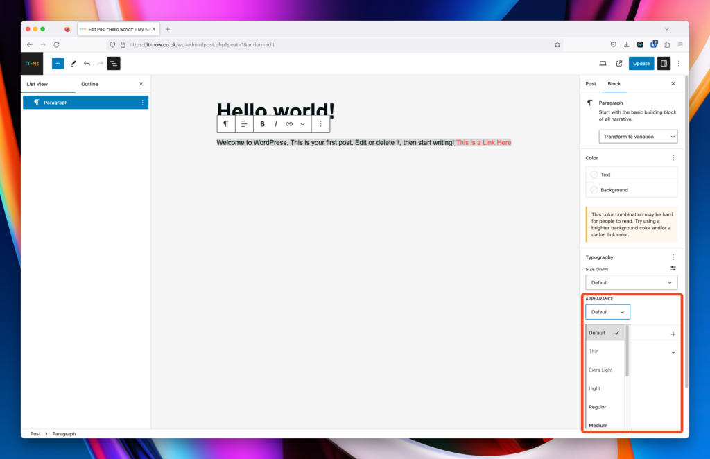
Note: Not all font weights will be available across all fonts – we suggest experimenting with what looks good.
Line Height (4)
You can change the default (1.5) line height which helps with spacing out your paragraphs.
Enable Line Height (1) and adjust accordingly.

Letter Spacing (5)
You can change the letter spacing of your text to make it breathe more.
Enable Letter Spacing and adjust accordingly.
Units available are:

Examples of Letter Spacing
Default (Unset)
1px (pixel) letter spacing
3px (pixel) letter spacing
1rem (root em) letter spacing
Note: We suggest experimenting with these settings to get a good reading experience for your site.
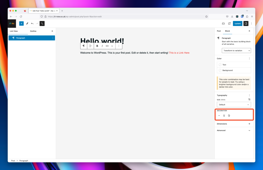
Text Decoration (6)
Text decoration in web design and typography refers to the various embellishments or stylistic changes that can be applied to font characters.
Enable Text Decoration and adjust accordingly.
Options available are:
Letter Case (7)
You can change the letter case of your paragraph text easily.
Enable Letter Case and adjust accordingly.
Options available are:
Drop Cap (8)
Drop caps, short for “dropped capitals,” refer to the typographic style where the initial letter of a paragraph is enlarged and “dropped” down to span multiple lines of text. The primary purpose of using drop caps is decorative, aiming to add a touch of elegance and draw attention to the beginning of a section or chapter.
Enable Dropped Caps and adjust accordingly.
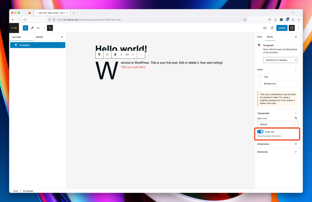
Here is an example piece of test that has Drop Caps enabled in Popcorn Theme. Notice how the first letter of this paragraph is enlarged to add extra style to your content. Not really used that often but has an interesting effect when used in the right way.
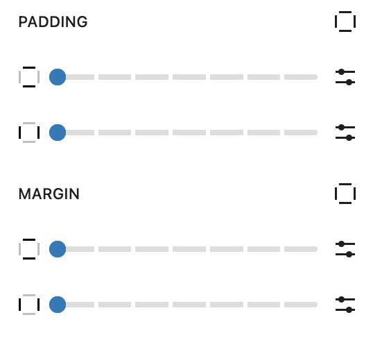
Dimensions
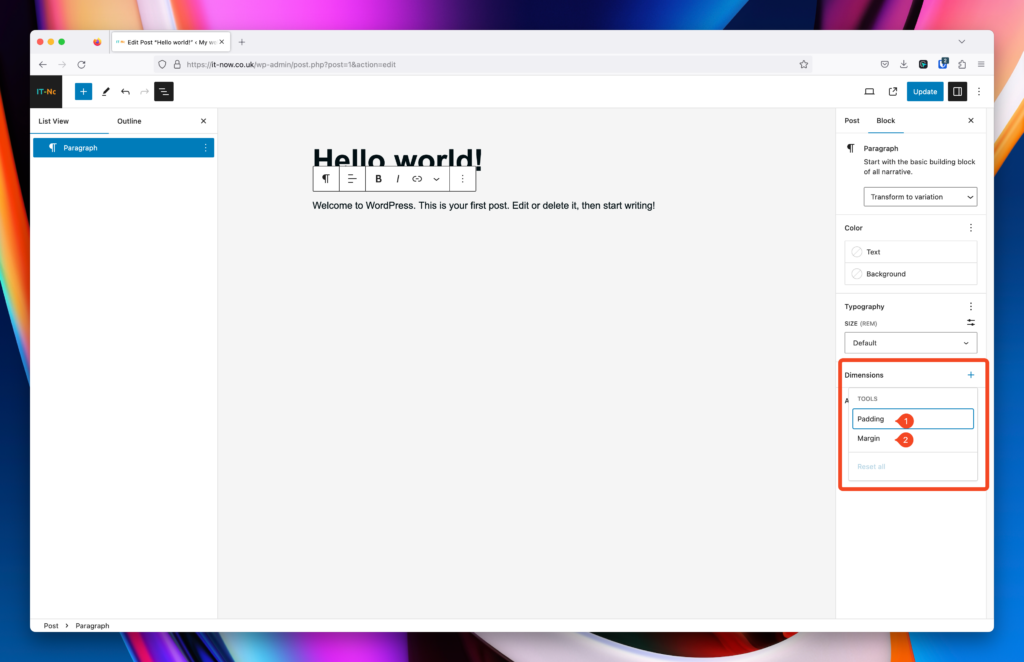
“Padding” is a term used in web design and development, particularly in the context of CSS (Cascading Style Sheets). It refers to the space or cushion between the content of an element and its border. Unlike margins, which create space outside an element’s border, padding creates space within the element, between its content and its border.
You can enable Padding (1) and Margin (2) in the block settings.
Padding
Padding will add space within your paragraph block. The easiest way to see how this works is to add a background color.
You can set padding in px, em, rem, or the default slider will use Presets.
You can set top, right, bottom, and left padding individually by pressing the unlink button.
Margin
Margin will add space outside your paragraph block. This allows for space between blocks/elements on your page or post.
As with padding, you can set top, right, bottom, and left padding individually by pressing the unlink button.
Advanced
Opening the Advanced section will enable you to add HTML anchors and apply custom CSS classes to your paragraph block.
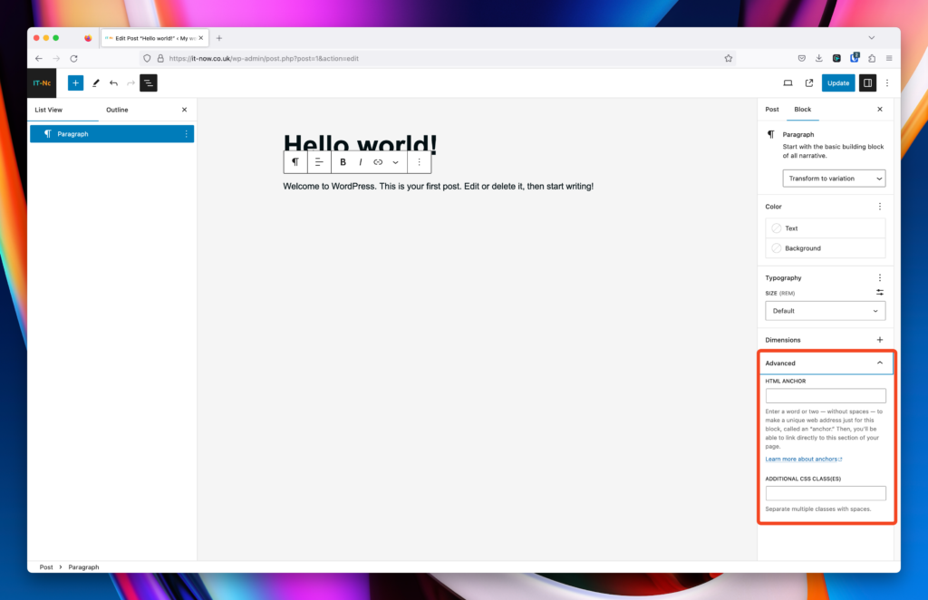
HTML Anchor
The HTML anchor field allows you to ad IDs to your paragraph blocks, you can link to these directly from anywhere on your site. For example if you had the IS of some-html-anchor on your element, you can link to that with your page address followed by #some-html-anchor
For example:
https://someamazingwebsite.com/your-amazing-post#some-html-anchor
Additional CSS Class(es)
You can add your own CSS classes to your paragraph block here. Classes should be separated by a space.
You can add your own class(es) and target them in your own CSS.
Leave a Reply